What Colour Rug for a Purple Room
Purple is a colour that rarely whispers. Whether it appears as a soft lavender wash or a deep aubergine statement, it carries mood, personality, and a certain emotional confidence. In interiors, purple often signals intention rather than accident, and that makes every accompanying choice feel more considered. Selecting a rug for a purple room is therefore not about taming the colour, but about understanding how it behaves in light, space, and everyday life.
A rug in a purple room has a particular responsibility. It must ground the space without dulling its character, offering balance rather than competition. The most successful pairings feel intuitive, as though the colours have always belonged together. This harmony comes not from strict colour theory, but from observing how purple shifts, warms, cools, and deepens depending on what surrounds it.
Understanding the Tone of Purple
Before considering rug colour, it is worth pausing on the exact shade of purple in the room. Purple is not a single note; it ranges from dusty lilac and heather to royal violet and near-black plum. A pale, greyed purple behaves almost like a neutral, while a saturated jewel tone demands more respect. The rug must respond to this nuance rather than simply match or oppose it.
Rooms painted in lighter purples often benefit from rugs that add warmth and substance. Deeper purples, on the other hand, usually need relief and lightness to avoid becoming overly heavy. Observing the purple at different times of day is helpful, as natural light can shift it dramatically. The rug you choose should feel right in both morning clarity and evening softness.
Neutrals That Let Purple Breathe
Neutral rugs are often the most elegant companions to purple. Shades such as warm ivory, stone, mushroom, and soft grey allow purple walls or furnishings to remain the focal point without overwhelming the room. These colours create breathing space, especially in rooms where purple is used generously. The effect is calm, confident, and quietly luxurious.
Texture becomes particularly important when working with neutrals. A flat, lifeless neutral can feel disappointing against a colour as expressive as purple. Instead, consider rugs with subtle tonal variation, visible weave, or a gentle sheen. High-quality collections, such as those by Brink & Campman, often excel here, using texture to elevate restrained palettes into something far more engaging.
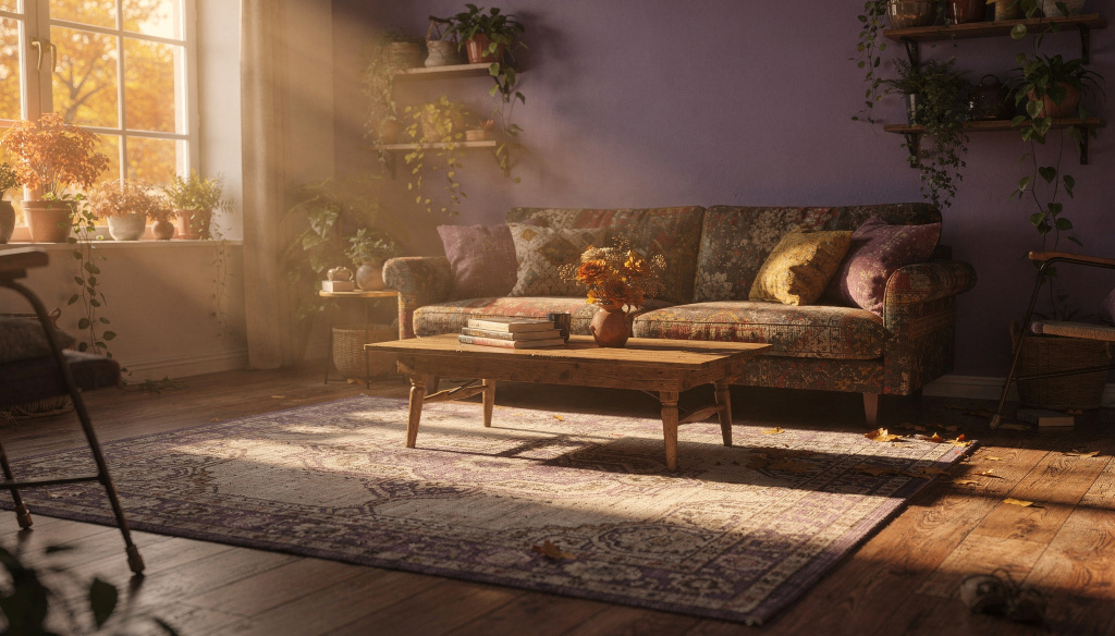
Earth Tones for Warmth and Balance
Earthy colours sit beautifully alongside purple, especially in rooms that feel slightly cool or formal. Clay, terracotta, warm taupe, and muted caramel introduce warmth without clashing. These tones echo natural materials and help anchor purple in something familiar and grounded. The combination feels particularly at home in living rooms and bedrooms where comfort is paramount.
The key with earth tones is subtlety. Highly saturated browns or oranges can feel jarring next to purple, while softened, mineral-based hues blend effortlessly. A rug that combines several earthy notes can be especially effective, creating depth without distraction. This approach lends a lived-in quality to a purple room, making it feel welcoming rather than theatrical.
Pattern as a Conversation, Not a Contest
Patterned rugs can work beautifully in purple rooms, but they must be chosen with restraint. When purple is already present, the rug’s pattern should feel like a conversation rather than a debate. Designs that incorporate hints of purple alongside complementary tones often feel the most natural. They create continuity while still offering visual interest.
Brands such as Harlequin are particularly adept at this balance, blending colour and pattern in ways that feel modern yet approachable. Their rugs often use purple as an accent rather than a headline, allowing it to echo through the room rather than dominate. This layered approach feels thoughtful and dynamic, especially in contemporary spaces.
Deep Blues and Inky Contrasts
For those drawn to richer, moodier interiors, deep blue rugs can be striking in a purple room. Navy, indigo, and inky blue-black tones create depth and sophistication, particularly when paired with darker purples. This combination feels enveloping and dramatic, well suited to rooms used primarily in the evening. The effect is less about contrast and more about resonance.
Care must be taken to ensure sufficient light and variation. Without lighter elements elsewhere, the room can feel overly enclosed. A rug with subtle patterning or variation in pile can prevent this, catching light and adding movement. When done well, this pairing feels confident and intentional, evoking a sense of quiet drama rather than heaviness.
Celebrating Purple Through Harmony
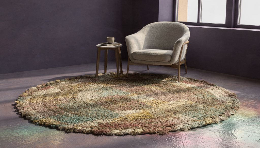
Sometimes the most satisfying choice is to embrace purple more fully. Rugs that include purple within a broader palette can unify the room beautifully. This works best when the rug introduces additional colours that soften and expand the scheme, such as muted greens, gentle pinks, or warm neutrals. The purple then feels integrated rather than isolated.
Collections from makers like Louis de Poortere often excel in this layered colour approach, combining tradition and modernity with remarkable ease. Their designs feel rich without being heavy, offering complexity that rewards long-term living. In such rooms, the rug becomes a bridge between colour, furniture, and atmosphere.
Living With the Choice
Ultimately, the right rug colour for a purple room is the one that supports how the space is used. A formal sitting room may welcome contrast and drama, while a bedroom may call for softness and reassurance. The rug should enhance daily experience rather than exist solely as a design statement. Over time, the most successful combinations are those that continue to feel right without demanding attention.
Purple is a colour of depth and emotion, and the rug beneath it should share that sensibility. When chosen thoughtfully, it does not dilute purple’s impact but refines it, allowing the room to feel balanced, expressive, and entirely its own. The result is a space that feels complete, not because every element matches, but because everything belongs.