Rug Colours That Have Had Their Moment — and What to Buy in 2026
Every few years, a colour or palette achieves such saturation in the interiors market that it crosses the line from prevalent to exhausted. The transition is rarely dramatic. There is no single moment at which a shade becomes overused; rather, it accumulates — in showrooms, in shelter magazines, in the background of social media interiors content — until the eye registers it not as a colour choice but as a default. At that point, the piece stops communicating anything about the person who chose it and starts communicating only that they were paying attention to the same things everyone else was paying attention to. For a floor investment that will define a room for a decade or more, this is a problem worth taking seriously.
What follows is not a trend forecast in the conventional sense. It is a more useful exercise: an honest assessment of which colour directions in rugs have reached the point of over-familiarity, and a considered case for the alternatives that genuinely reward long-term living.
The Grey Decade Is Over
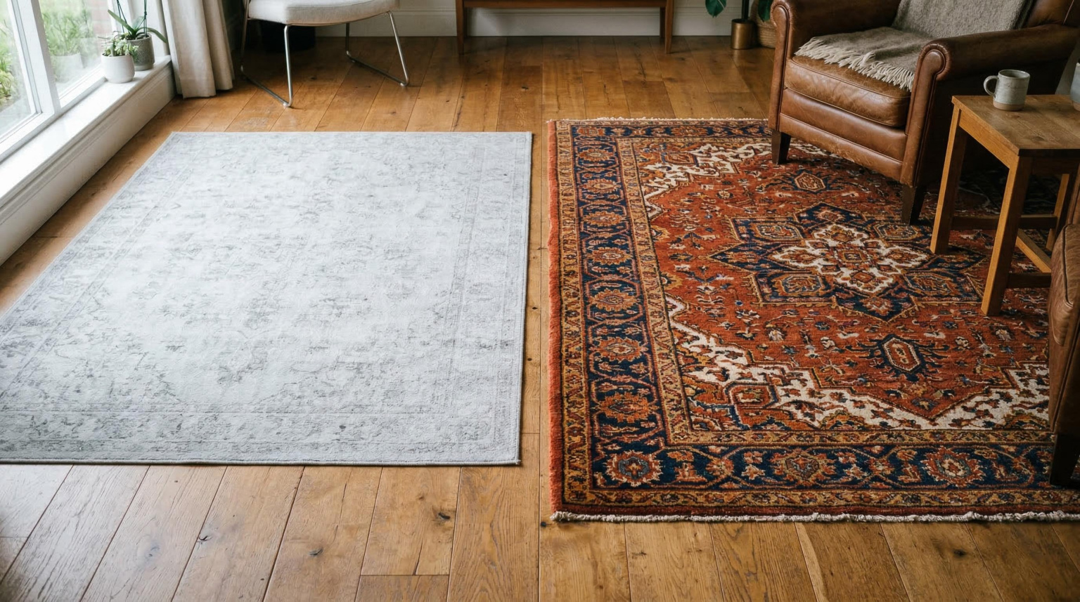
Grey dominated the interiors landscape for the better part of fifteen years — first as a refined alternative to the beiges and creams it displaced, then as a near-universal default, and finally as a presence so ubiquitous that it ceased to signify anything at all. In rugs, the grey phase produced an enormous quantity of pieces in pale, cool, and mid-tone neutrals that were sold on their versatility and their ability to work with everything. They work with everything because they contribute almost nothing. A cool grey rug in a living room is the decorative equivalent of a non-committal answer.
The particular problem with grey at the floor level is that it reads as cold in natural light, colder still in the artificial light of an autumn or winter evening, and actively hostile to the warm materials — timber, leather, aged brass, terracotta — that constitute the most enduring language of domestic comfort. If your current rug is a pale grey and your room feels as though it is refusing to commit to any particular atmosphere, the rug is very probably the reason.
Blush and Millennial Pink: Affectionate Farewell
Blush pink, that particular washed-out rose that colonised interior photography from approximately 2015 onwards, has not aged well at floor level. In smaller soft furnishings — cushions, throws, ceramics — it retains a certain delicacy. In a rug, where it occupies several square metres of visual field and must survive the scrutiny of daily use, it tends to read as both provisional and already dated. The saturation of blush in the mid-range interiors market over the past decade means that a pink-dominant rug now carries a very specific set of cultural associations — associations that have less to do with considered colour choice and more to do with a particular moment in Instagram aesthetics.
This is distinct from pink as a serious colour choice. A deep, complex rose — the antique pinks of Persian carpet traditions, aged and abrash-rich, quite different from the flat, even blush of a contemporary manufacture — remains one of the most beautiful tones available in a hand-knotted rug. The distinction is between a colour used with depth and knowledge and a colour used because it was prevalent.
Coastal Blue: From Fresh to Formulaic
The coastal blue palette — pale aqua, washed denim, chalky navy, seafoam — reached peak ubiquity somewhere around 2022 and has been in gentle decline since. At its best, it produced interiors of genuine lightness and calm; at its worst, it became a formula applied without reference to the specific character of the room, the quality of its light, or the nature of its architecture. In rugs, the coastal palette tends to produce pieces that are pleasant without being remarkable, liveable without being memorable. For a piece that will occupy the centre of a principal room for a decade, pleasant is not sufficient.
The particular problem with pale blue at floor level is its instability across different light conditions. A rug that reads as fresh and bright in a south-facing room in summer can appear wan and slightly mournful in a north-facing room in January. Colour choices at the floor must be evaluated across the full range of light conditions a room experiences, not merely in the optimistic circumstances of a showroom or a well-lit photograph.
What to Choose Instead: The Colours That Endure
The antidote to trend-driven colour selection is not conservatism but intelligence. The colours that have proved their longevity in domestic interiors are those with genuine chromatic complexity — tones that shift with the light, read differently from different angles, and resist the flatness that causes colours to date. These are also, not coincidentally, the colours most naturally associated with the materials and processes of fine rug-making.
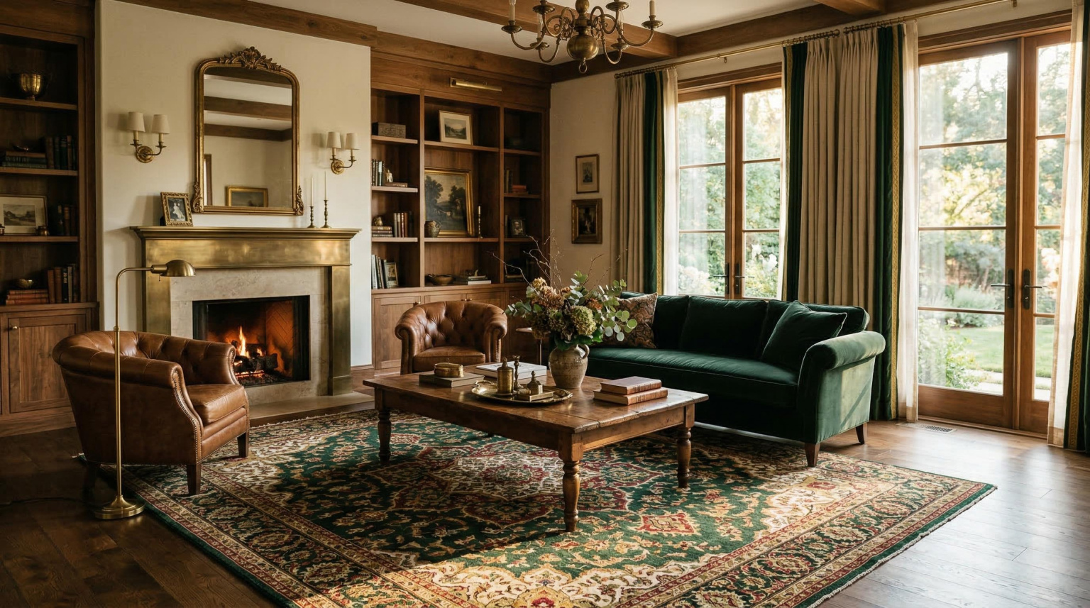
Terracotta, burnt sienna, and the warm earth spectrum. The resurgence of earth tones has been so sustained that it risks becoming its own cliché — but the specific tones most relevant to serious rug selection are not the chalky, trendy terracottas of the high street but the richer, more complex iron reds, ochres, and amber-browns of the finest natural dye traditions. These are colours with four thousand years of proven domestic utility; they warm a room, complement timber and stone, and age into depth rather than deterioration.
Deep, complex greens. Forest green, verdigris, aged sage, the particular dark green of old malachite — these tones have a gravitas and a naturalness that lighter, more saturated greens lack. In a hand-knotted pile dyed with natural weld and indigo overdye, a deep green achieves a richness that no flat digital rendering can convey. It recedes elegantly in a busy room and asserts itself with quiet authority in a minimal one.
Indigo and its relatives. Not the bright, even navy of a synthetic dye but the complex, depth-laden blue of natural indigo — a colour that contains traces of purple, of black, of the particular darkness of deep water. Indigo-dyed pile has a directional quality, reading differently in raking light and direct light, that gives a rug movement and life across the course of a day.
For rooms where the instinct runs towards colour used confidently and with genuine visual impact, the category of bright rugs repays careful exploration — not in the sense of garish or fashionably saturated, but in the sense of colour applied with conviction and the full chromatic richness that quality materials and skilled dyeing can achieve. A rug of genuinely vivid colour, properly made, is a far more enduring commitment than a pale one: its vitality is a function of its material quality rather than its novelty.
Pattern: The Variable That Outlasts Colour
Colour trends are more volatile than pattern trends, but the two are not independent. The pale, plain, or near-plain rugs that dominated the grey and coastal phases were partly a response to the maximalism of the layer-everything aesthetic that preceded them. The correction, as corrections usually do, went further than necessary. The result was a generation of interiors in which the floor — the largest uninterrupted surface in the room — was treated as a neutral backdrop rather than as a compositional element.
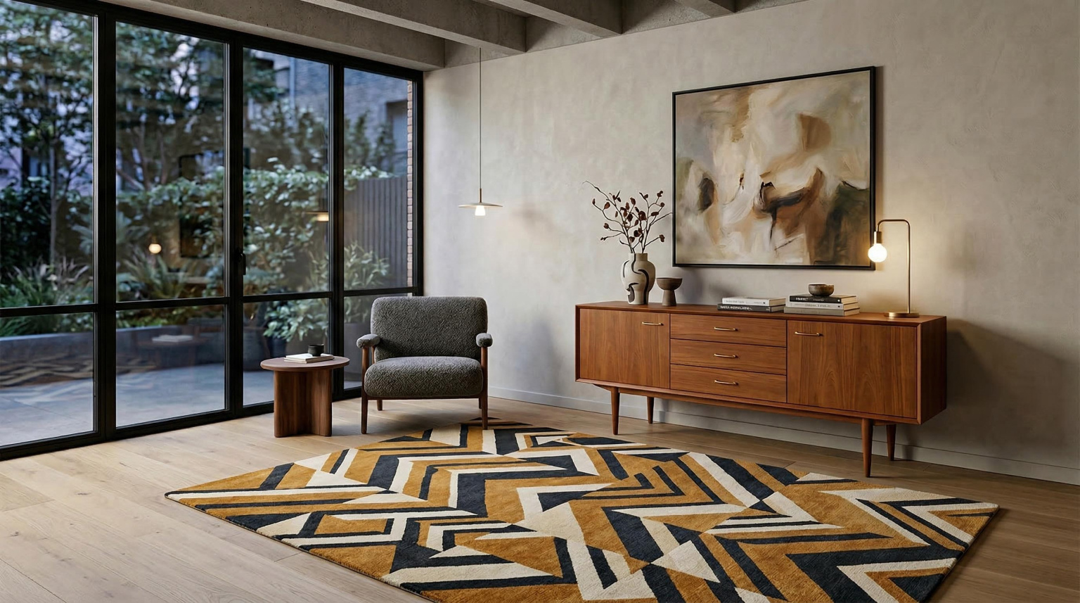
The most durable floor investments are those where pattern provides the primary interest rather than colour alone. A strong geometric, a well-resolved medallion, an abstract expressionist field — these are designs whose visual life is relatively independent of whether their specific colour palette happens to be fashionable at the moment of selection. A rug with genuine pattern intelligence looks interesting when its colours are in fashion and continues to look interesting when they are not, because the interest was never primarily about the colour.
The finest hand-knotted rugs demonstrate this most clearly. The pattern resolution achievable at high knot densities — the precision of a curvilinear border, the clarity of a geometric repeat, the subtle shading of a field that transitions from one tone to another across hundreds of thousands of individual knots — produces designs whose visual richness is structural rather than superficial. These pieces do not rely on a particular colour moment to make their case; they make it through the authority of their construction.
The Designers Working Against the Trend Cycle
A reliable way to select a rug that will prove immune to the trend cycle is to choose from designers whose colour and pattern decisions are made from a position of genuine formal knowledge rather than market responsiveness. This is a smaller category than it might appear. Much of what passes for considered design in the rug market is, in practice, a reasonably sophisticated response to prevailing tastes. The designers whose work genuinely transcends its moment are those who draw from sources deep enough that current fashion is simply irrelevant to their decision-making.
Louis de Poortere represents a particularly interesting case in this context. The Belgian house, with its roots in 19th-century Flemish weaving traditions and its contemporary practice spanning everything from reinterpreted Art Deco geometrics to boldly graphic abstract designs, produces work that occupies a position of genuine independence from trend. The Louis de Poortere collections draw on the full depth of European and global textile history whilst maintaining a formal intelligence and chromatic sophistication that makes them as relevant to a considered 2026 interior as they would have been a decade ago or will be a decade hence. This is the quality that distinguishes a design with genuine authority from one that merely reflects its moment.
The Only Rule Worth Keeping
The most honest advice about rug colour selection in 2026 — or in any year — is to treat trend guidance as a filter rather than a prescription. The colours identified here as over-familiar are not bad colours; they are colours whose moment of maximum cultural saturation has made them temporarily less useful as expressions of individual sensibility. They will return, as all good colours eventually do, when enough time has passed for them to mean something again.
What will not change is the underlying principle: a rug of genuine quality, in a colour and pattern chosen with real understanding of the room it is to inhabit, will remain a compelling presence long after the trends it was never part of have cycled through their seasons. The floor is not a mood board. It is the room's foundation, and it deserves to be treated as one.